SpellSlingers' Nevin Portillo
A downloadable game
I'm Nevin Portillo, one of SpellSlinger's programmers here to showcase my contributions to our team's game!
What Even Is SpellSlingers?
SpellSlingers Itch.io page --> https://assrael-dev.itch.io/spellslingers
SpellSlingers Trailer --v
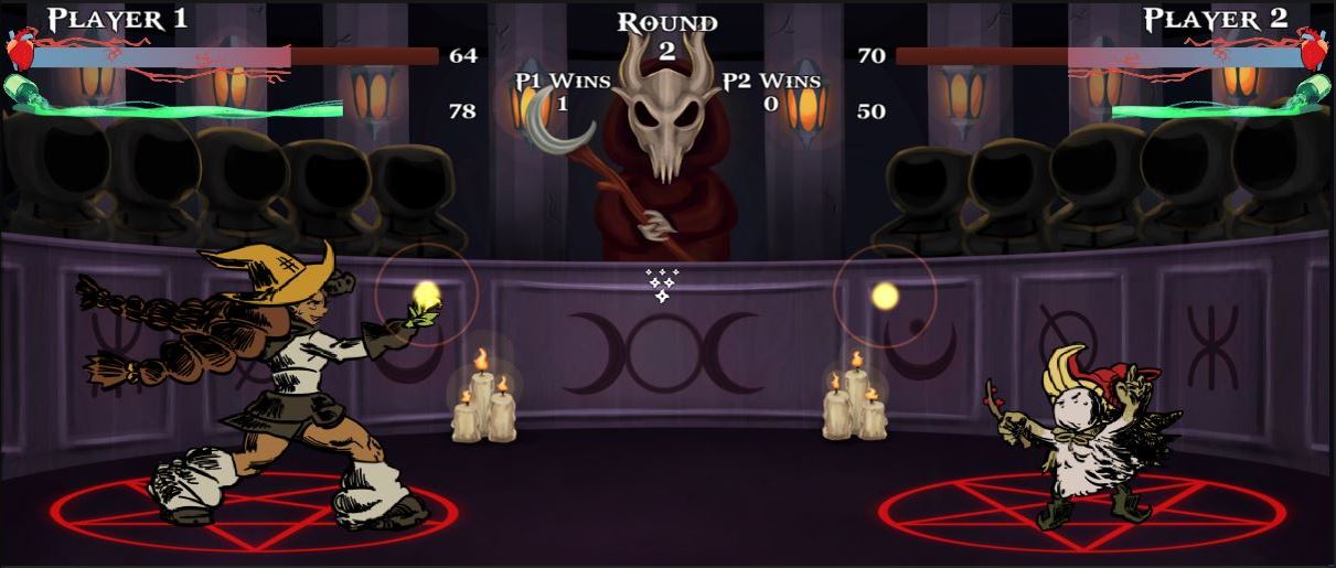
SpellSlingers is a magic-themed 1v1 arcade game where you and another opponent wield wands and shake them as much as you can in order to cast a powerful spell! Players can choose between different wizards, fight in various stages, and even switch out their physical character-themed wands!
Role Overview
My main role in the development of SpellSlingers was programming, along with the other programmer Sophie Toon. However, my focus was more on three main things within the game: the functionality of the core loop; the tutorial; and our accessibility feature being the sensitivity slider.
Contribution Highlights
Most of the final project is shown in our team's itch.io page, however, here's where my programming role has played a crucial part in the creation of SpellSlingers!
Core Gameplay

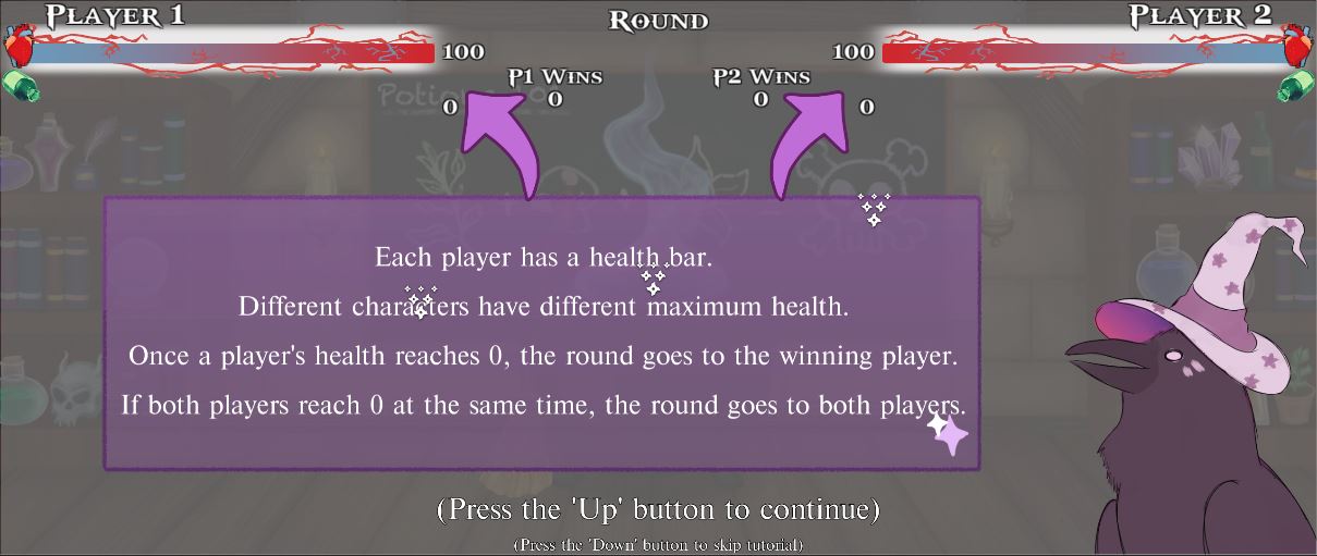
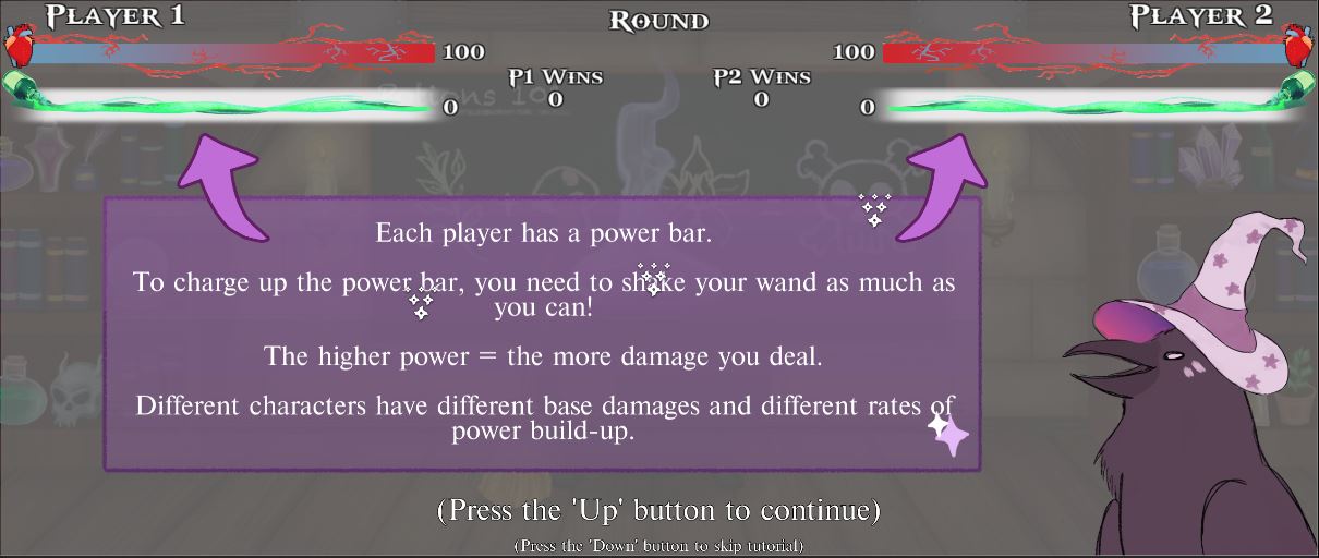
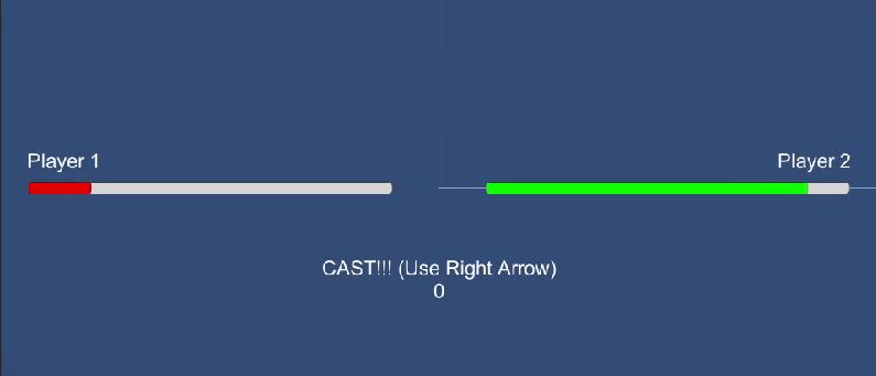
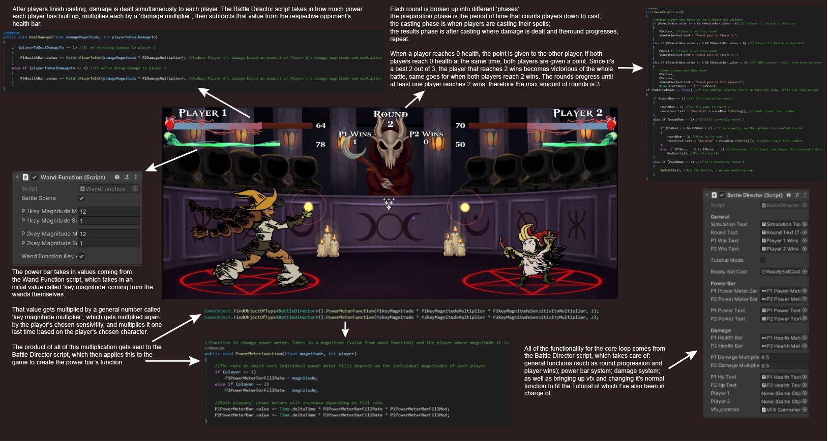
Most of my focus was on the core gameplay, which needed to include things like a damage system, power build-up functionality, a round progression system, the different phases within each round, and so on. All of these functions occur in my Battle Director script. Besides that, there had to be a lot of game design balancing through changing values to make sure that there was a good feel between the players and the game.
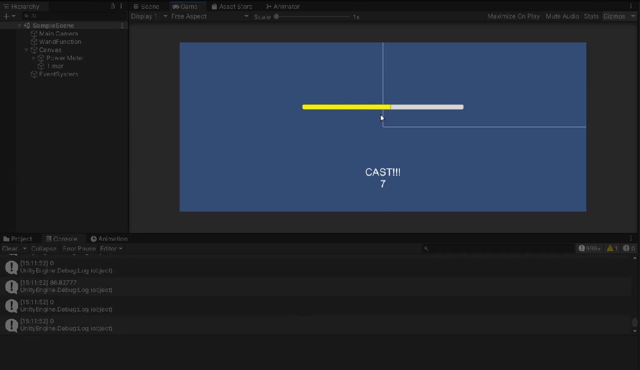
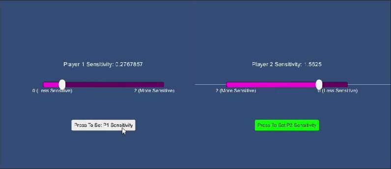
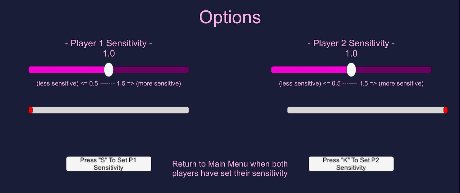
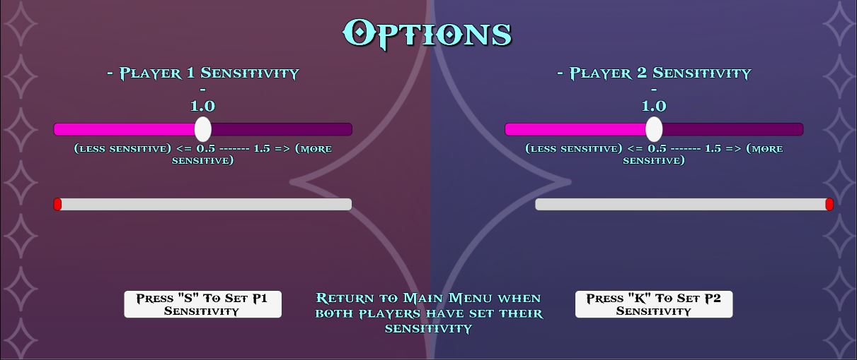
Sensitivity Options

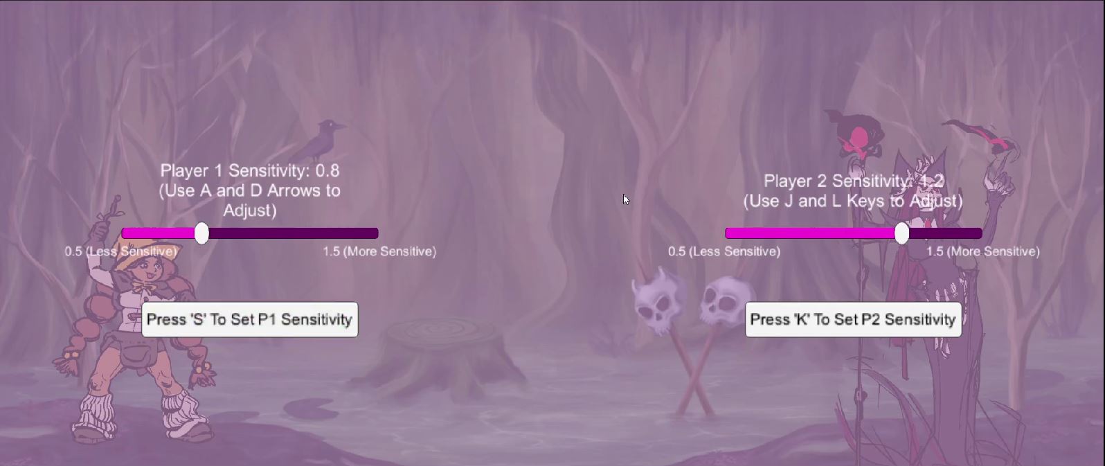
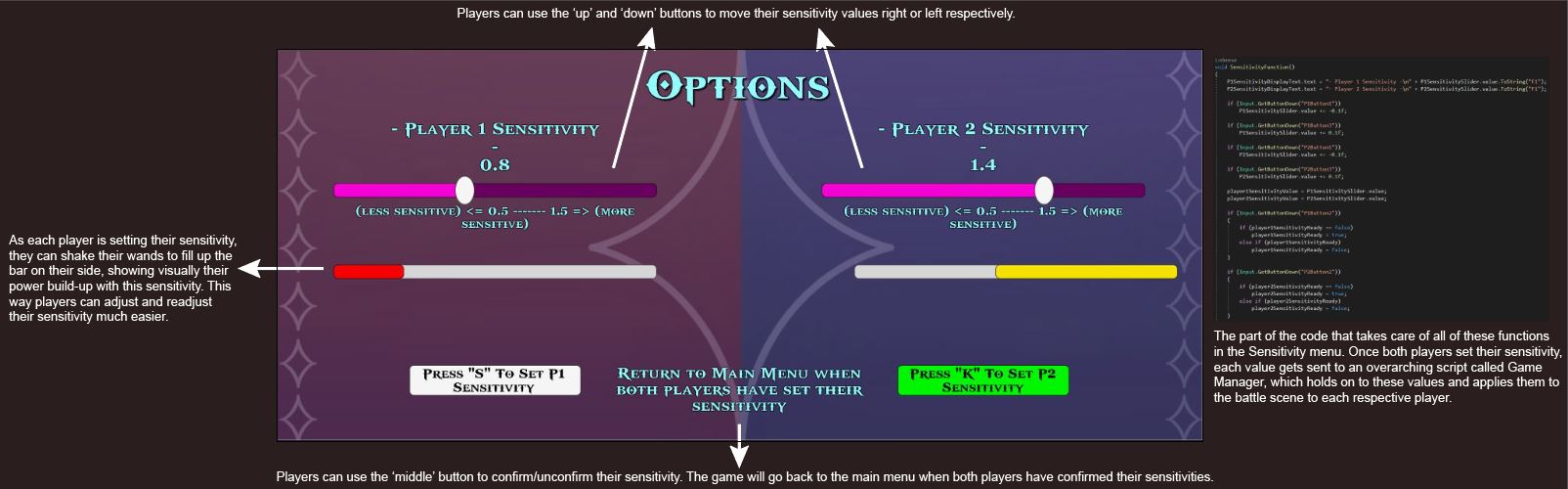
The sensitivity options is our main accessibility focus for SpellSlingers. Here, players are able to adjust their wand's sensitivity to best match their feel. This accessibility element caters to those who may have trouble shaking their wand due to limited/overt motor functions, so these players are able to raise/lower their sensitivity to make it easier.
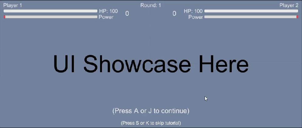
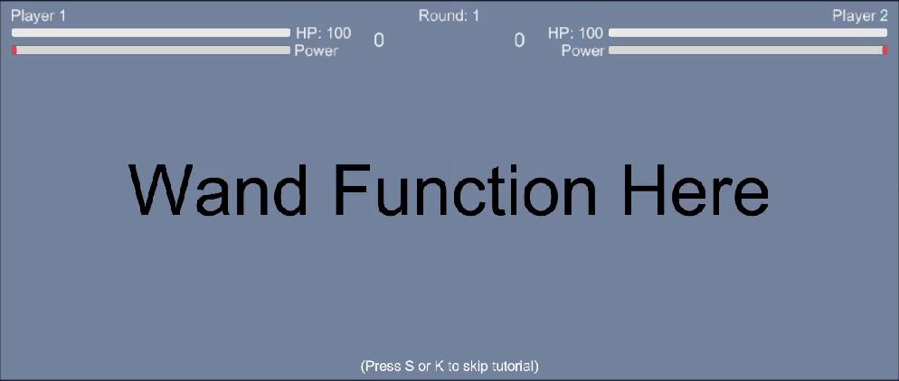
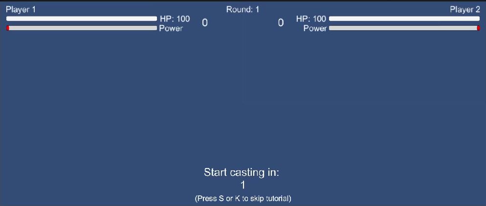
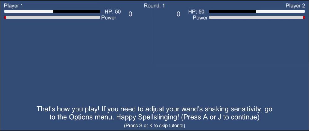
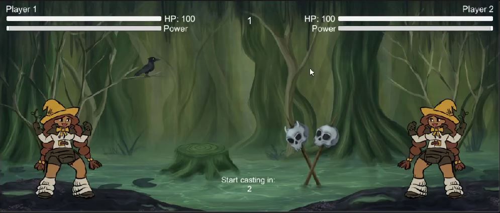
Tutorial
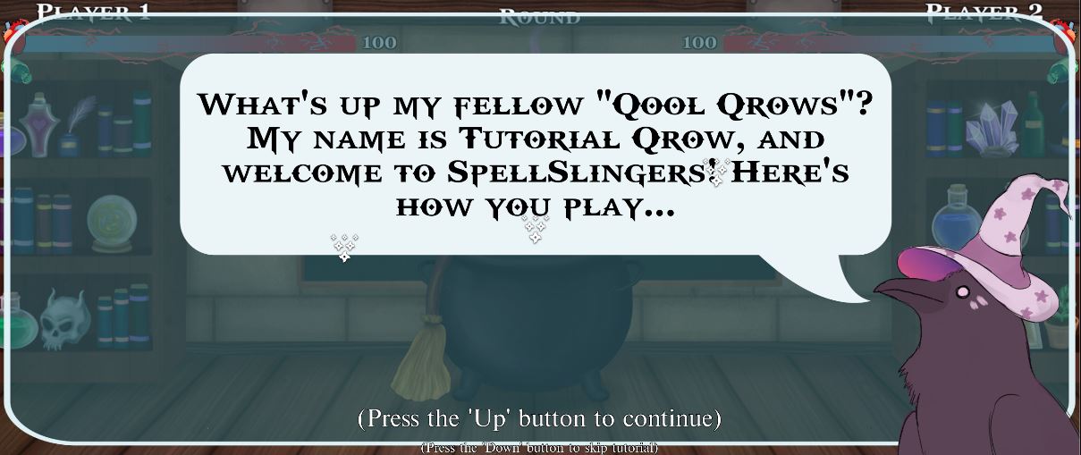
Introduction
UI 1/3 - Health
UI 2/3 - Power
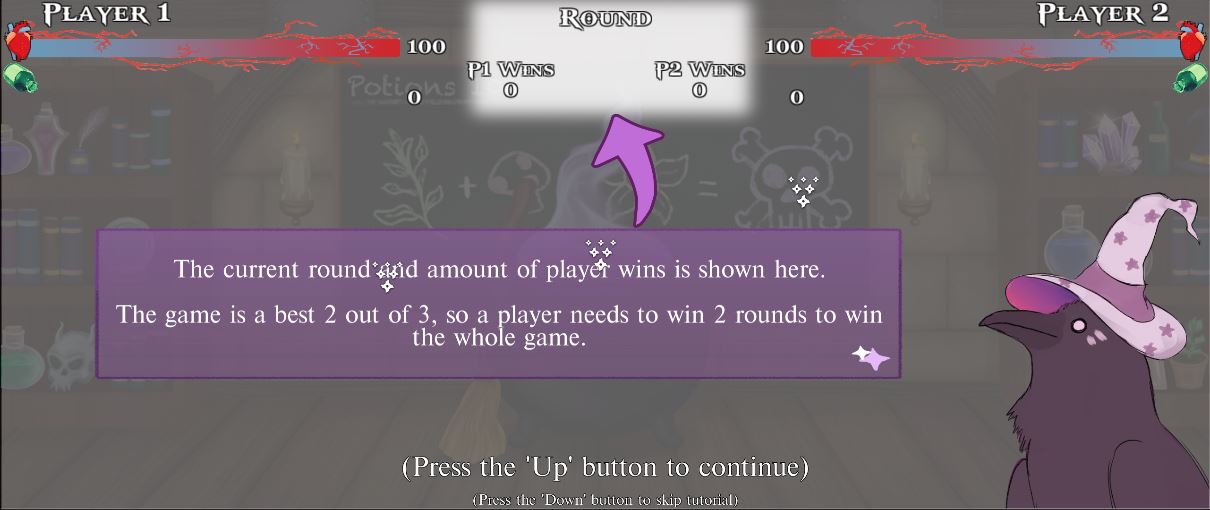
UI 3/3 - Rounds and Winning
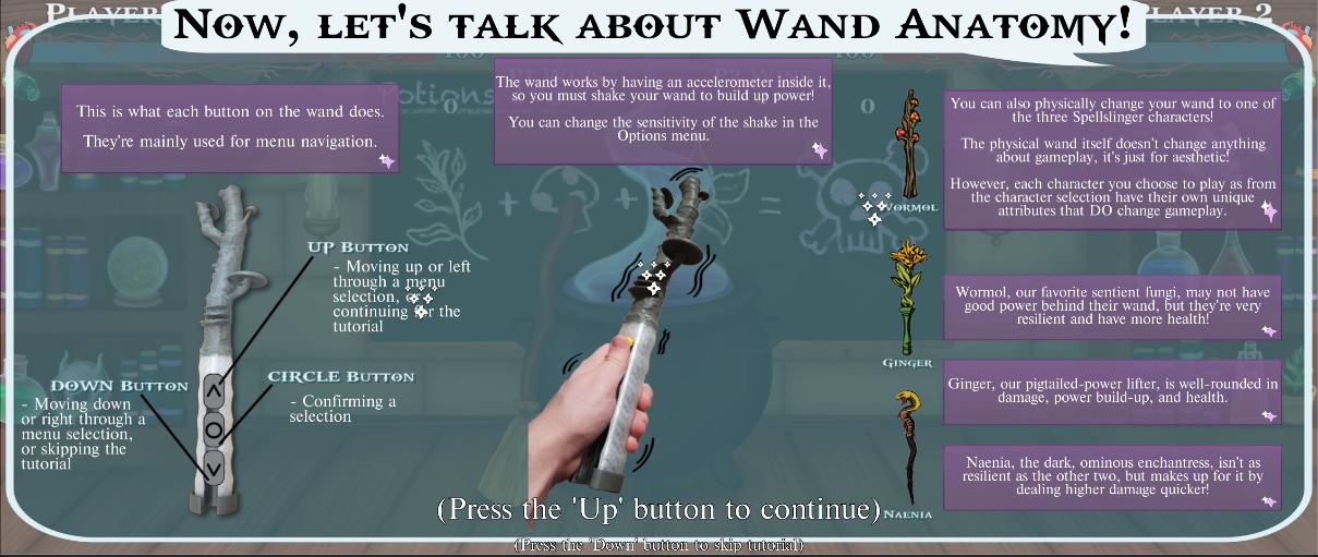
Wand Anatomy and Characters

Simulated Battle

Conclusion
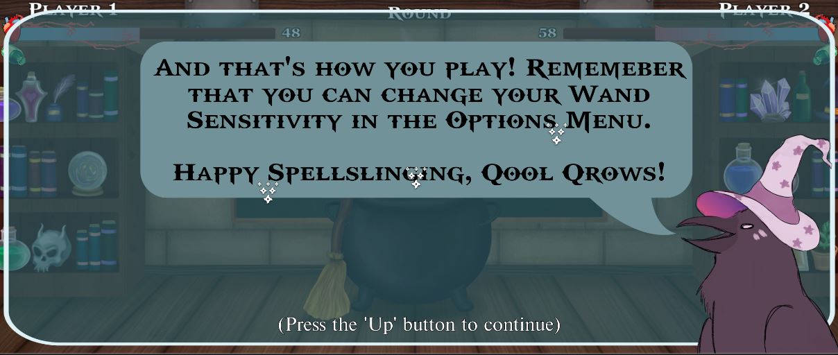
I was in charge of the tutorial scene of our game, taking the art assets (all created by Sarah and Sanchi, two members from our team) and putting them together and arranging them through each stage of the tutorial, as well as the tutorial script. The script mainly focuses on progressing from one stage of the tutorial to another, and changing text and visual elements along with it, so most of the highlight comes from the tutorial itself rather than the code. One thing I did have to adapt for the tutorial is the Battle Director, which has a 'tutorial mode' on it since near the end of the tutorial both players are asked to go through a simulated battle, which needs the functionality of the Battle Director, but not fully.
Process Overview
From Concept To Deliverable 1
A lot of design changes have been made ever since our team originally came up with our game's concept. Our project had to go through different milestones known as deliverables, each one month apart. These were dates where we would showcase the stage of where our game is at, what we've done so far, and what we plan to do next. A lot of the heavy lifting happened between the time of our game's original concept to the first deliverable one month later.
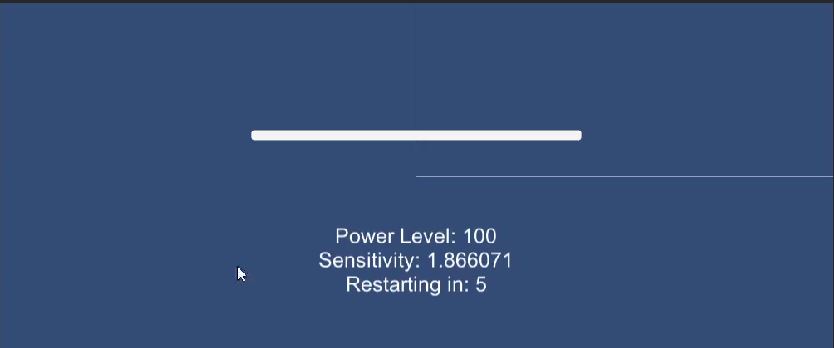
Starting with the first work on the very early prototype, I was creating the power-build up's foundational functionality using mouse input, and immediately after that I was also focusing on the sensitivity adjustment for the accessibility component of SpellSlingers.
After figuring out how the wand would at least behave within the game, as well as sensitivity, I expanded to include a second player (since that's one the most crucial basis for our game). One design change from here was switching from testing with mouse input over to keyboard input. This was because the physical wands, whenever they got finished in the very late development of our game, would show up in Unity as a joystick input, which aligns more closely to a key input rather than mouse. Knowing this early on, it was easy but also important to switch to keyboard, that way the rest of the game could be built on preparing itself to lastly take in physical wand input without much trouble.
As I was working on this, our artists have been getting A LOT of work done with our art assets, and after they've finished with some placeholders and backgrounds I integrated my wand function and sensitivity to fit more as the gameplay UI that we were trying to figure out. With this I also started working on the damage system!

From Deliverable 1 To Deliverable 2
From our original concept, we've had the idea of having multiple types of spells and using the buttons along with how you shake your wand, each spell being dominant or recessive towards other certain spells, similar to rock-paper-scissors or elements from Pokemon. We thought of various ways to do this and settled for a type of 'spell progression', where round 1 would show players 1 spell and how to cast it, round 2 would show players 3 spells and how to do each one, round 3 would show 5 spells and how to do each one, and that's it. However, that idea would end up turning into a stretch goal that would never be reached as there were other crucial elements that we needed to implement that we needed to allocate time for.
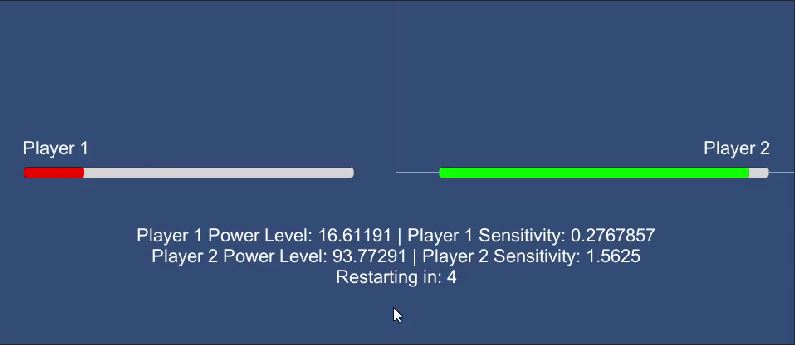
Firstly, I started working on the round progression system. If a player reaches 0 health, the round goes to the other player (as of this video I haven't shown the UI to show player wins yet, but was existent). If a player reached 2 wins then the core loop would just end, successfully having a 'best 2 out of 3' win condition.
During the early stages of the round progression, we originally had it so that if both players reached 0 health at the same time, whoever had the most power would win that round. However, it was hard to see that visually and also there were some bugs with the code that didn't seem to execute that. So in the much later stages from now we eventually opted to give the round to both players if a tie were to occur. This means that there was now the possibility of having an overall tie as an end result.
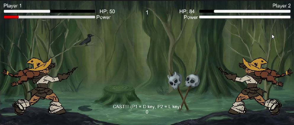
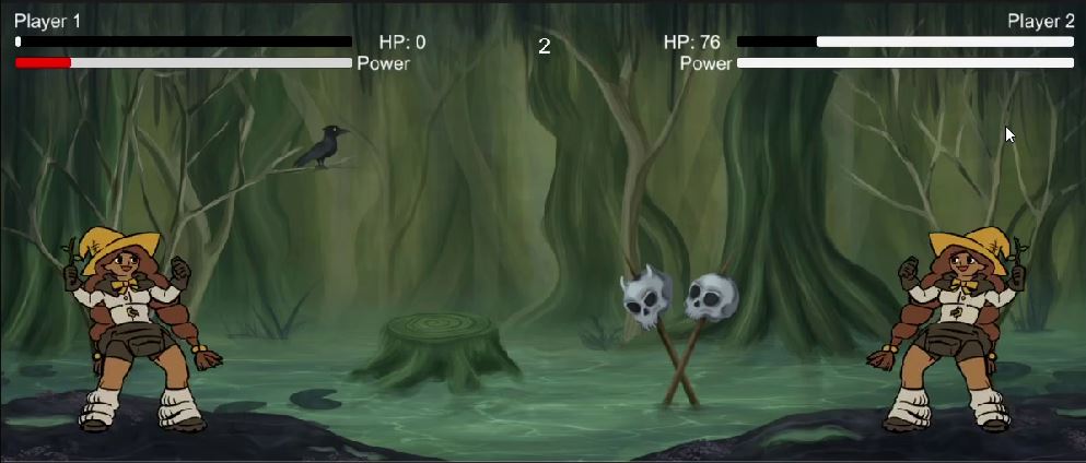
There were also some other smaller changes to the core loop, such as timers. It was previously mentioned in the Core Gameplay callout sheet in the Contribution Highlights section, but there are different phases that repeat within each round: preparation phase, casting phase, and results phase.
Originally when we were planning to have multiple spells and their progression (as mentioned in the beginning of this section), the preparation phase would drop an overlay which had all of the different spells and how to perform them. This list was shown to both players, but they aren't able to select any spells, instead they would just read off the instructions for their desired spell, then in the casting phase the game would figure out what spell each player is doing. Because we turned that idea into a stretch goal and realized it would probably not be met, we had to adjust some timers to go by quicker, as well as changing to only display the timer on certain phases. Along with this there was also some balancing for the general power build-up and damage dealing.
It's also important to mention again that in the earlier phases of the game, since I was just running tests for how wand and sensitivity behavior would occur, we had the sensitivity 'screen' always show up before the wand function, then after the wand test was done it would go back to the sensitivity 'screen'. Our team already knew that this wasn't gonna be the case for the later stages of this project, but when it finally came down to where we wanted to implement sensitivity there was discussion on the best way to go about it. Finally we settled on having an Options menu in the main menu, but were still discussing on 'what other options could we have in this menu?'. We couldn't have audio adjustment since this was an arcade game, it NEEDS to be loud in such a busy environment. Our game didn't have any color-specific elements to it, so there was no need for a color-blind mode. Therefore, we agreed that just having the sensitivity in the options menu was necessary for our game.
The biggest thing to work on for deliverable 2 was the tutorial scene. There was a lot of discussion on how our tutorial was going to work, because we're making an arcade game, the tutorial should NOT be long, it should be short and explain simple ideas as that's the nature of an arcade environment. It was also important to figure out what parts of our game should we explain, and how much in detail should they be explained. For deliverable 2 I created the skeleton of our tutorial, which was very much in an unfinished state as I had to wait on the art assets to be finished.

From Deliverable 2 To The Final
Most of the work that I've done during this final stretch of time was mainly bug extermination, polish, and putting together art assets, as well as finalizing the tutorial.
For the tutorial, originally we planned to show ALL of the UI elements and just highlight and explain them all in one screen in the UI portion, but after deliverable 2 we figured it would be best to go through them one at a time, talking about health first, then power, then rounds and winning. Most of the adjusting during the tutorial was making sure it was short and concise, so the biggest thing was changing the delay timers between each stage of the tutorial from a long 5 seconds to 2 seconds.
The main focus during the tutorial however was putting in art assets as they came in finalized, which the final result can be seen in the Contribution Highlights section. Not only did I integrate some of these assets to the tutorial, but to the core gameplay as well, now having the final art assets for the gameplay UI.
The sensitivity menu also got revamped with font changes and a background!
Final Thoughts
This arcade game was the first major project that I've worked on, as well as the first arcade game that I've worked on! It's my belief that as an upcoming game developer it's crucial to dab into different fields in the industry in terms of genres, platforms, game engines, and hardware, so contributing to the development of this game from start to finish was definitely an eye-opening experience! I've also learned more about teamwork as I do with any group project, and seeing as how my team and I are all students there's a LOT of improvement to be done. Regardless, I'm proud of the contributions my other teammates gave to this project, and although it's not perfect, I've really enjoyed the journey from prototype to the final stage!
To you, reader, make sure you check out the itch.io page for SpellSlingers! https://assrael-dev.itch.io/spellslingers


Leave a comment
Log in with itch.io to leave a comment.