Inevitable - by Nevin Portillo
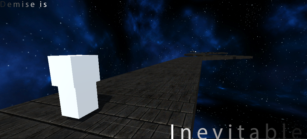
Take a step into the surreal world of a breaking mindscape. Controlling the conscious of this mind's corporeal form, try to reach the light at the end to escape the chains of this corrupting mental state. Will you be able to escape the darkness? Or will you realize that your demise is Inevitable?
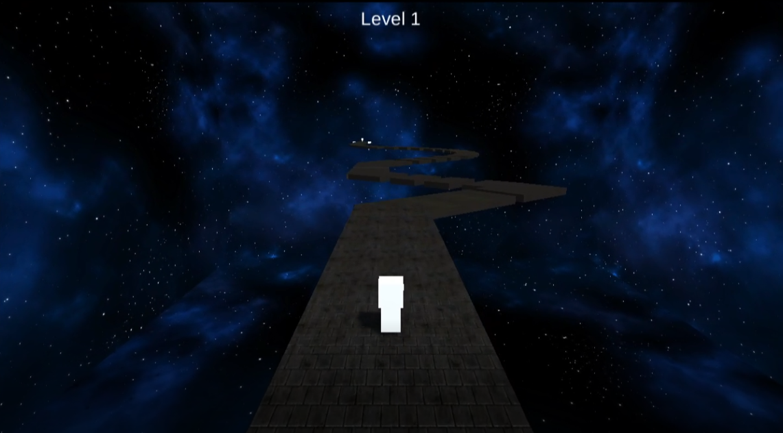
- An automatic runner/platformer.
- 5 unique levels
- Space to jump.
The theme of this game is supposed to be a reflection of mental health and one of my representations of depression. The goal of this game is to provide those who don't suffer some sort of insight of the mind from those that do.
Note: everyone experiences depression and mental health differently, this is an attempt of representing my personal experiences.
Process
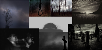
This project is for my AET 318c class, and we were assigned to use any base code and concept for our final project. I used this waypoint following system code by Michael Baker (in credits) and built my level around it. Of course I thought of the concept and idea to translate through the game mechanics I chose, and created a moodboard, which shows a lot of dark and explicit content and ideas, and I made sure to use assets that reflect that such as the space skybox and road material (in credits).
In terms of level design, I wanted each level to get increasingly difficult as the player progressed, and it was difficult with the automatic nature of the base code, so I went with a platformer.
Level 1
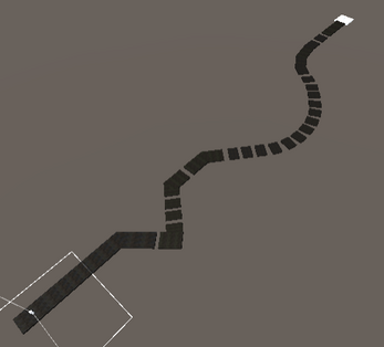
The screenshots of the levels are in chronological order. For level 1, I thought that the most simple way to start off would be with a flat path, where users get used to the simple controls on a flat, unwavering environment. This introduces the players to the theme of the game with the skybox, platforms, and the design of their character and destination, which are one and the same, a reflection of a bright mindset.
Level 2
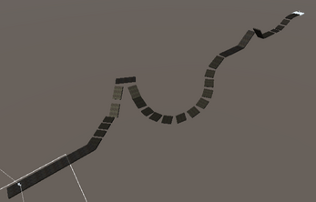
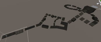
Moving on to level 2, I wanted to increase the difficulty and keep that trend throughout the level, and thinking of the future levels, it was very difficult to figure out how to add difficulty with my limitations. Therefore, I though of add elevation, contrasting from level 1's completely flat path, level 2 has slopes going up and down while leading the player straight or at a curve.
Level 3
Level 3 introduces tilted and inconsistent platforms. Whereas levels 1 and 2 had vertically straight platforms, including the slopes, and were all pretty much uniform and neat, level 3 has platforms that tilt towards and away from the player, and some of them are abnormal in size. This level also changes the skybox from being a cool blue to a purple-cyan mix space color, and at this point players will also notice that their character and destination are starting to fade away. It's not as obvious on level 2, but it definitely occurs, and users will notice in this level.
Level 4
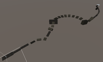
Level 4 was very tricky to make, especially since I was having a hard time figuring out how to increase difficulty while refraining from making an extended copy of the previous level. I decided to make multiple pathways, where although the true path of the character is preemptive, players think that the character will go one way, but instead it goes the other. Also, the character and destination are drastically transparent, giving a foreshadow of the end look for the players.
Level 5
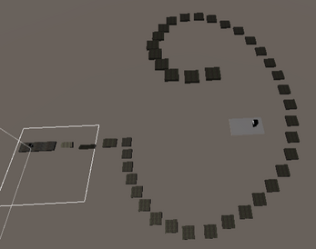
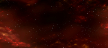
Level 5, unlike the previous levels, didn't take as long to come up with and create. I didn't focus much on making the level even more difficult than the last, but rather I wanted it to be some grand finale. Although this doesn't take the concept of tilted and irregular platforms or fake pathways, it was actually difficult for what it was. I went for a simple spiraling staircase that goes a single and full 360 turn, ending with a drop to the destination. The difficulty came from consistency, the players had to jump for every step of that staircase and make sure that they keep their timing, lest they fall into the abyss. The hardship also comes from having that perfect timing, making sure that they jump at the very end of the platform as being too short will make them collide with the next platform's vertical wall. The look of the level is very different and I think reflects the concept of the game well, with a red and flaming space skybox it represents the downfall of this individual's conscience. Also, the character and destination have changed completely, where in the previous levels, the consistent trend was that they were fading away. The foreshadow was that in the end, they would fade away into nothingness, but the design takes a hard left turn with showing a black character and destination. This represents the completion of corrupting darkness, where the fading of light can no longer cause dark to yield to it, and therefore takes over.
Credits:
- Space Skybox - "Dynamic Space Background" by DinV Studio (Unity Assets Store)
- Road Material - "Yughues Free Pavement Materials" by Nobiax/Yughues (Unity Assets Store)
- 3D Game Mechanics - Base Code by Michael Baker
| Status | Released |
| Platforms | HTML5 |
| Author | NvN |
| Genre | Platformer |
| Made with | Unity |
